Interview by Simona Serban

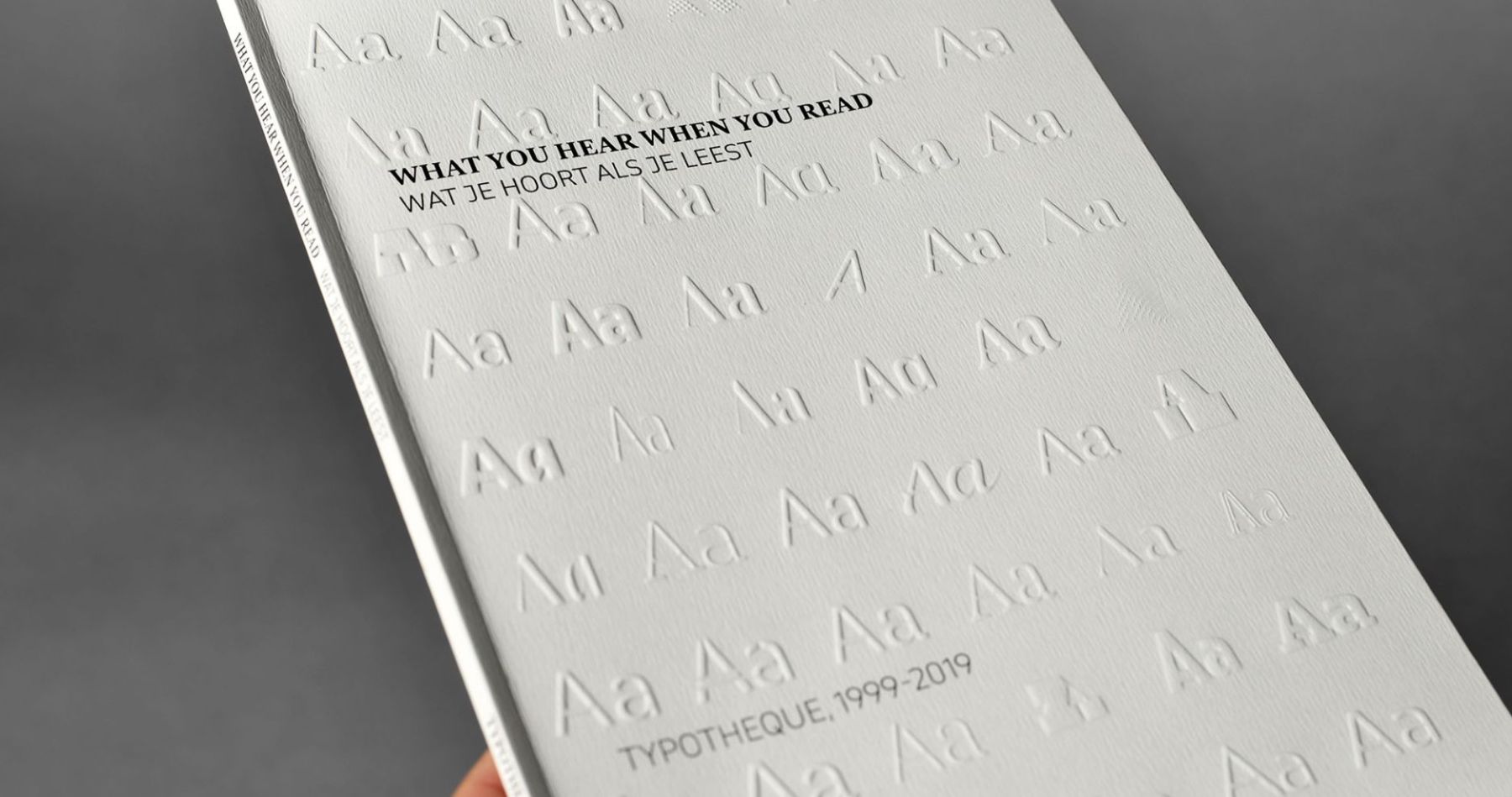
Typotheque is a Netherlands-based type design company focused on constantly searching for and developing new forms of creative expression in written form. Founded in 1999 by Peter Biľak, their mission is? Supporting all world living languages and working with many endangered languages to revitalise and make them usable in the digital age. This is how they developed modern and authentic fonts for most languages, preserving the historical value of cultures. In their own words, they have been shaping language, pushing the boundaries of technology.’
‘Typotheque’s work has been recognised by most professional associations winning many awards, and their fonts selected into Best typefaces of all times by FontShop.’ One of their biggest achievements was in 2009 when they created pioneering concepts in web fonts, thus becoming the first type design studio to license its entire font collection for use on the World Wide Web via our web font service. In their multidisciplinary design work practice, the team at Typotheque have focused their entire practice on helping communities digitising their languages.
One of their biggest achievements was in 2009 when they created pioneering concepts in web fonts, thus becoming the first type design studio to license its entire font collection for use on the World Wide Web via our web font service. In their multidisciplinary design work practice, the team at Typotheque have focused their entire practice on helping communities digitising their languages.
A project showcasing the studio’s passion for the preservation of languages is Syllabics Project, a short documentary film they made to bring attention to the process of Indigenous language revitalisation and preservation efforts in North America, changing the standards of Canadian Syllabics fonts to make them accessible to local communities. In our interview, we focused a lot on this project they created. This is an exquisite example of what superpowers words have: to strengthen communities, help people engage more in conversation, and improve their lives.
In their own words, we shift our attention from form to meaning; we enjoy taking on a broad scope of cultural and commercial projects in a wide variety of media. Over the past decade, we have designed postage stamps and oversized posters, organised events, curated and designed books, rugs, ceramic tiles, and exhibitions, and conceived ballet performances. We rarely receive content and give it an ‘appropriate’ form; we believe that design should happen at a more fundamental level than just playing with the layout. We usually get involved with projects early and advise on early concepts and distribution and production of projects.
Typotheque thrive in enthusiasm and a unique approach to their crafts, emphasising the power of spoken and written words with the proper fonts. Discover their vision of the future for languages in the modern era and how we can better understand, protect and communicate in an increasingly digital, international and multicultural world.’
Given the specificity of your design studio, our first question has to be this: what does typography & languages represent for you, and why do you focus your practice on interpreting it as many mediums you have done so far?
Type makes language material. Our communication is fleeting, unstable, and impermanent without visual shapes to represent the language. Plenty of languages still have only oral use, and often they are on the brink of extinction. The invention of writing allowed collaboration between strangers, and each sign needed to be designed by someone. Surprisingly, considering how omnipresent typography is, very few people shape the language visually. Yet, this is what type does; it gives it a shape, tone, and a unique voice that helps the reader interpret the very abstract letters. It is humbling to see our work on public signage, children’s books, or in any form where it can be helpful.
Challenging and reshaping the role that technologies can play in culture and society is part of Your studio’s mission is, in your own words, ‘to support all world living languages, working with many endangered languages, helping them to revitalise and make them useful for the digital age’. What attracted you to this side of design, and what made you go the extra mile to create and showcase a stronger bond between typography, fonts & languages? What made you follow this path in your studio’s practice?
I was born in Czechoslovakia, and my first language was Slovak. Unfortunately, when I started designing, hardly any digital fonts supported the Central European diacritics, so I was forced to hack the fonts and make them. It made me realise how shortsighted it is to create support for some languages only and exclude others because someone decided there is no market for them.
In our studio, we decided not to apply only market economy but also consider the cultural impact of projects. We’ve created digital fonts for many minority languages, which are often ignored. Why create a font supporting English when hundreds of thousands of options are already available, while there may be very few or even no options for other languages? It may sound like altruistic motivations, but we discovered that creating the first proper fonts for complex languages of India or rarely used Syllabics can also be economically viable, as publishers want to be sure that they can support these languages too.
In one of your most recent projects – The Syllabics Project – you showcase the power of written and spoken words. Still, more than that, you showcase the real, applicable superpower words have: to strengthen communities, to help people engage more in the conversation and generally improve their lives. In this project, you designed complete fonts for the Canadian aboriginal languages for the first time. You also proposed new missing characters to be encoded by Unicode so that they can be supported across all devices. Can you tell us more about the project, what key findings you and your team took from that project, and your general experience with the whole design to implementation process?
It is hard to understand for someone speaking English, German or French that there are languages not supported by today’s computers. While the support of the Latin script has been solid for the past two decades, hundreds of languages are not encoded, meaning they cannot be digitally recorded. Therefore, one cannot text and blog in their language and, instead, is forced to use another language. Usually, the language of a former coloniser to be able to communicate. There are about 100 writing scripts which are not yet standardised and are not part of Unicode, the standard for the consistent encoding, representation, and handling of text. In such cases, the work starts with language documentation and community outreach to understand how languages work. After completing the documentation phase, we can think of strategies to enable written communication.
In the case of the Canadian Syllabics, we identified some dialects, for example, within the Nattalik communities in Nunavut, the northernmost territory of Canada, where people couldn’t write their own names correctly. The Syllabics script was encoded in the 1980s and missed some sounds required for Nattilingmiutut, a dialect of Western Nunavut. We have worked with the local community on drafting the documents and submitted a successful proposal to the Unicode consortium. Only after this foundation work were we able to dedicate ourselves to designing fonts that fully support the Indigenous languages of Canada; besides publishing these fonts, this project has also changed the digital text standard in Unicode for all Syllabics typefaces.
In addition to the work you do with languages, you also focus on publishing & performance art; how do these projects fit into your creative process, and do you notice during the developing process of your language & typography projects their influence?
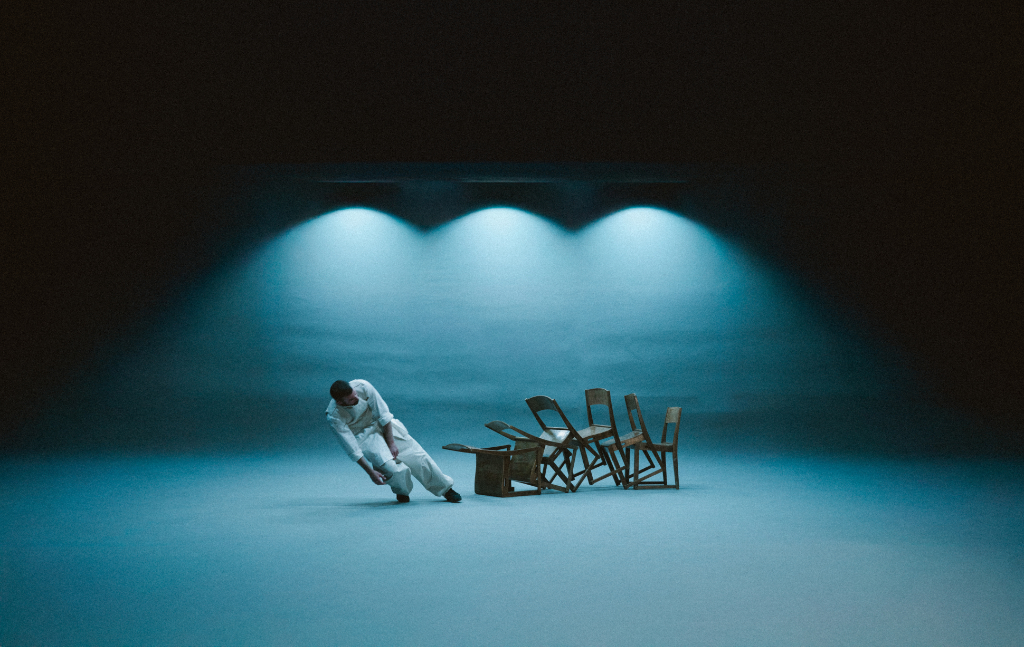
We enjoy working with the public, regardless of the medium. Sometimes we tell stories in written form and publish them online or in print; sometimes, we organise symposiums and performances. I became interested in clarity of communication and the impact of design, so I sought opportunities to test ideas and connect with audiences. This exchange makes our work stronger, I think. For five years, I have been publishing Works That Work, a magazine about unexpected creativity and the impact of ideas. And for the past 15 years, I have been working with dancer/choreographer Lukas Timulak to create new modern dance performances. Together we started a foundation for multidisciplinary collaboration.
Some of your studio’s research projects are focused on India, known as one of the most linguistically and culturally diverse places on our planet, but what attracted you and your team to this particular part of the world to conduct your specific research and what do you aim to achieve with it? What is your main goal?
By now, we work with all living languages, so we are naturally attracted to places with great linguistic diversity. No one knows exactly how many languages are spoken in India. It is likely in thousands. Unlike the European languages, they are not alphabetic and require some complex text shaping to compose the text, and often the western-created technology doesn’t present these languages correctly. We document the linguistic and technical requirements of many Indian languages and create digital fonts that reliably render the local languages.
We share this knowledge online, which allows for improved written communication. So next time a software company wants to create an app that works with local languages or local designers want to create signage or publications for local audiences, they have the tools to do so. We have worked with Devanagari, Tamil, Bangla, Gujarati, Malayalam, Telugu, Kannada, Gurmukhi, Odia, Meetei Mayek, or the Ol Chiki writing scripts, supporting most of the Indian languages.
What is your vision for the future of languages, typography and maybe even the sustainability or impact of preserving and paying attention to all languages?
People often believe that improvements in technology solve problems. And they do, in many different ways. But in my field, using technology alone strengthens dominant languages at the expense of minor, marginal languages. For example, one cannot use Siri and Alexa in Icelandic, Maltese or Gujarati, so instead, people switch to English to ensure the technology understands what we need. This further endangers minor languages, and there are estimates that more than half of the languages used today will disappear by the end of this century. So we do our tiny bit to allow languages to thrive so that we can preserve the knowledge and information available only in those languages.
What is your chief enemy of creativity?
Lack of focus. That’s why I switch all computer and phone notifications when I try to work.
You couldn’t live without…
Water, sun and air.