Interview by Jonathan Bergström
Working across video, projection, large-scale installation, and a variety of media, Paul Tzanetopoulos has spent decades developing a practice rooted in conceptually grounded work that engages the senses. Born in Athens, Greece, and based in Los Angeles, California, Tzanetopoulos was an early pioneer of video installation in the city, using light, colour, and perception not just for visual effect, but to explore the social, political and ecological forces shaping modern life.
Emerging in the 1970s, he began working with video projection as an experiential medium, presenting a computer-run intermedia installation as early as 1974. While grounded in painting, his practice quickly expanded to incorporate evolving technologies, always prioritising concept over medium. As he describes it, technology functions less as spectacle than as an extension of the canvas, an invisible mechanism through which ideas take shape.
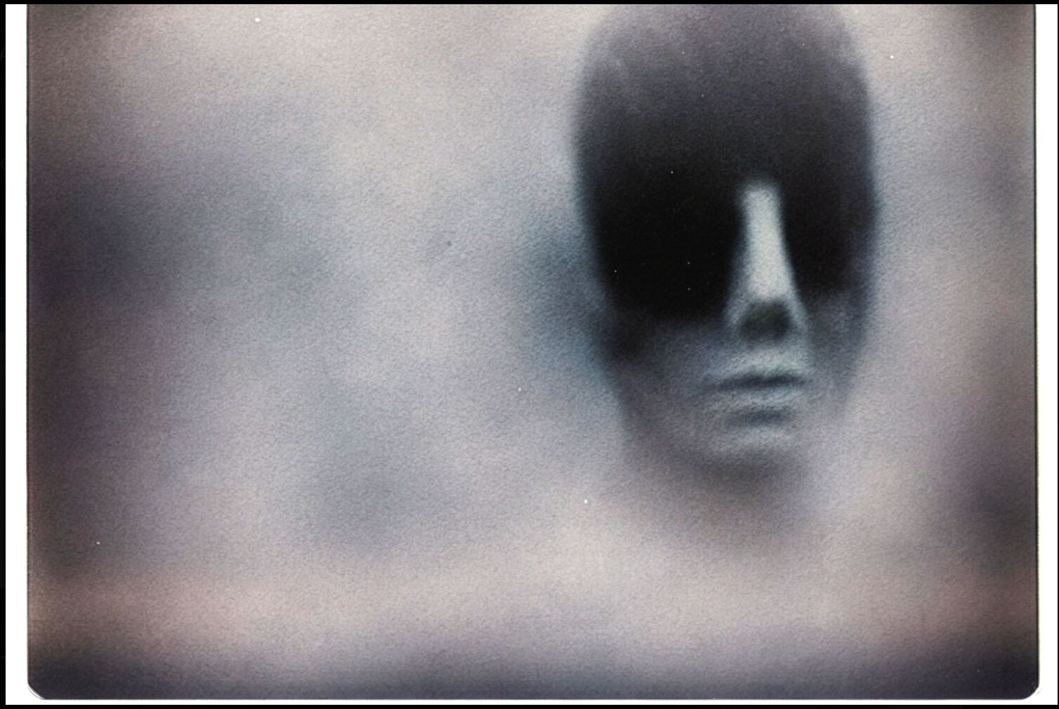
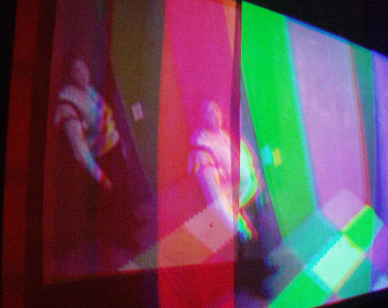
This approach is evident in Speed of Color, where viewers become active participants in a space shaped by projection and reflection. Entering as observers, they are confronted with their own image, broken apart through shifting fields of colour. The work blurs the line between subject and object, showing how perception shifts with position without settling into a fixed reading.
In contrast, installations like Dirty Red and Harry place this focus on perception within a more social context. Through interviews, sound, and carefully controlled light projections, Tzanetopoulos constructs a portrait of two unhoused individuals in Los Angeles. Colour separation and viewer interaction are used to reflect the instability and fragmentation of their lived experience. Here, light is not only a formal device but also a way of addressing visibility, marginalisation, and how people are seen within broader social systems.
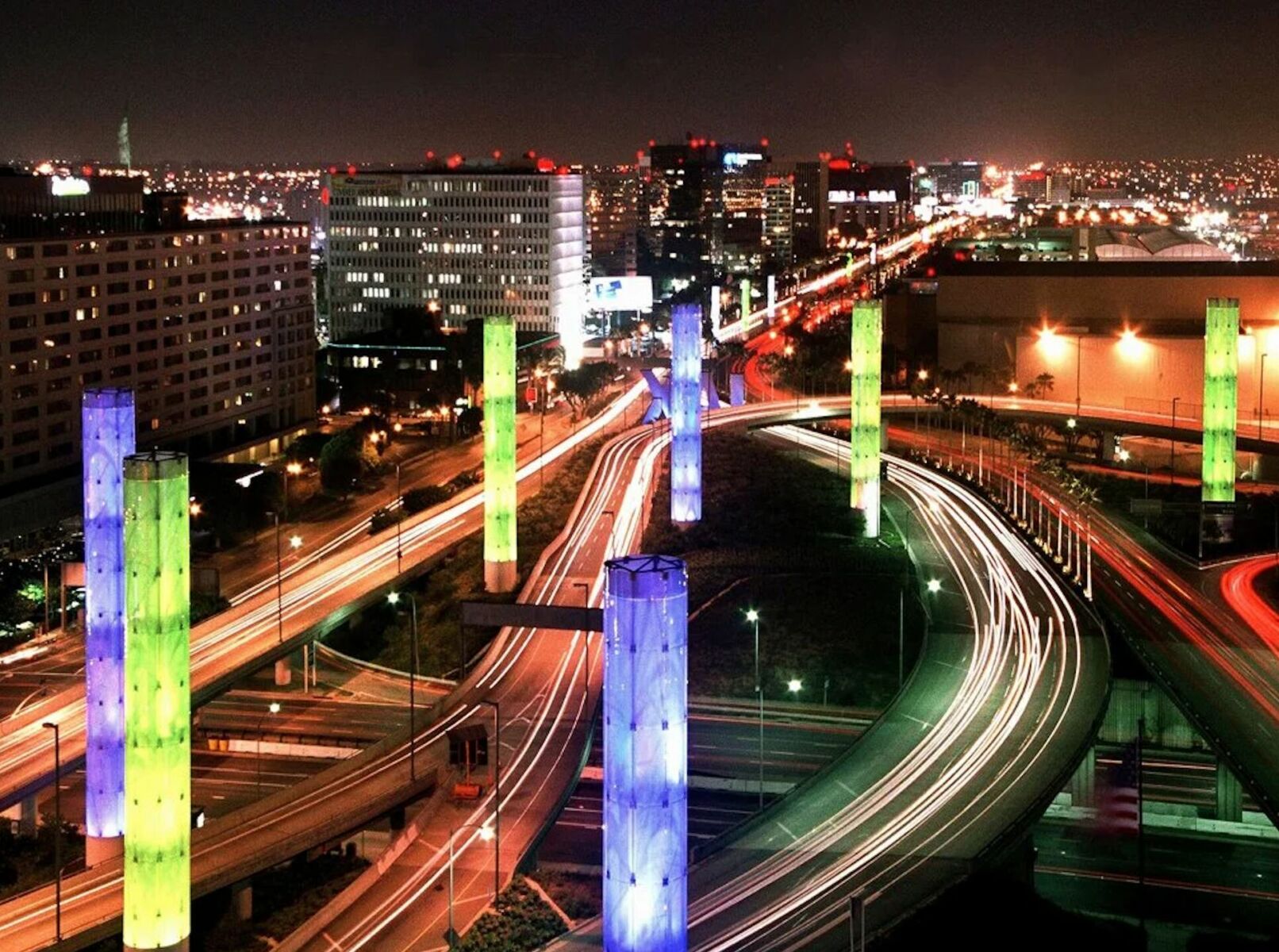
Perhaps his most widely recognised work, the LAX Gateway Pylon Project extends these concerns into the public sphere. Spanning one and a half miles, the kinetic light installation has become a familiar feature of the Los Angeles landscape, seen daily by thousands of travellers. Yet, as with much public art, its authorship often disappears behind it. Beneath its shifting colours lies an idea rooted in diversity and interdependence, with light patterns drawn from the flags and textiles of the city’s many cultures, as well as the blues and greens of air and water.
For those who may not be familiar with your work, how would you describe your practice?
I am a conceptually driven, interdisciplinary artist who works with the medium best suited to conveying the work’s conceptual root. I still am fundamentally a painter, so I judge the finished work through the eyes of a painter, striving for beauty and to engage the audience. I occasionally use uglier elements with deliberate attention to components of our geo-social culture that need work. It’s important to me to remind the audience of who they are, what they are, and where they are going, so they remember, as individuals, their influence on the planet.
You began working with video and projection in the early 1970s, well before such mediums became widespread. What initially drew you to these technologies, and how do you reflect on that moment now, particularly in relation to the work of other early video artists such as Nam June Paik?
I came to video and projection work through my love of light and cinema, and of their effect on me and what I judge to be positive for society. Moving light seemed to naturally draw the viewer in and engage them, both interactively and conceptually, so it was a very seductive tool from early on. The early video was black-and-white and tended to be sparse and conceptual, which I also appreciated, with its black-and-white distilling the concept and narratives within the video. I enjoyed working with this, but found more pleasure in working with colour, so I worked with colour video as soon as it was available, and brought production techniques to the video art of that time, both through my colour video portfolio and through engaging with the Long Beach Museum video lab with David Ross in the 1970s.
I was fortunate to work with Nam June on one of his installations soon after moving to California from Las Vegas, circa the mid-1970s. Before that, I met Bruce Nauman and sound artist Steve Reich. I was encouraged by my exposure to them and their methodologies. I shared my neon and fluorescent work and sound works with them, as I had already been employing light projections and video in my practice for a few years.
In Speed of Color, projection and reflection merge, incorporating the viewer into the work itself. How were you thinking about perception and participation in this early piece?
In Speed of Color, viewers entered a small auditorium as if they were about to watch something, and they ended up watching themselves through a curious artifact of light and colour. In the auditorium was a projection screen with a mirrored Mylar surface instead of a white field, so that coloured light from the projector first hit the mirror, illuminating and colouring the audience, then reflected onto the mirror.
My practice strives to engage the viewer through as many seductive tools as possible, to lend knowledge and appreciation for natural laws to the viewer. Not necessarily as a didactic element, but once a viewer tries to figure out what’s going on, they often get a glimpse of how colour and light actually work. It’s important to me to leave it as a mystery. All metaphors were in play. Seeing themselves through this alternate dynamic and as part of a group that was all the same colour was important to me.
With much of your work being conceptually based, do you seek out new media and technologies to express ideas, or is it the reverse?
Concept is paramount, and if I happen not to be aware of the particular technology to the degree that I can manipulate it, as a brush to paint, then I learn it. I have been exposed to technology since the late 1960s through NASA’s text briefs, and I was lucky enough to work as an art director in Las Vegas and to design special-effects projectors for the entertainment community.
These things came naturally to me, and I gained a great deal of knowledge from the unique mentorship of industry professionals there, whether in sound engineering, filmmaking, or lighting. They were the best. In my work, the application of these techniques was to be relatively invisible so the concept would rise to the surface using the tech as paint on a canvas. The issues and concepts that concern me are artifacts of geo-social culture: the dignity of humankind, concern for the planet, the effects of politics and religion, among others.
In projects like Sketzo Series, fictional cartoon entities repeat nonsensical ideas to each other, and in Postage Reality you forged a stamp to see if the attached letter would successfully traverse the postal system. Do you find humour or absurdity to be an important component of your explorations?
That is all true. I find humour and absurdity to be excellent tools for engaging my audience. Humour is often a more seductive entry point than creating something deliberately harsh or ugly. Many of my concerns plague me and often bring me to tears, so I use a light, often humorous approach to make a point. Sketzo is an excellent example of this: the title is derived from the Greek words for schizophrenia and drawing. My mother was schizophrenic, and it was ever-present in my world as a point of despair for the family, dealing with the awful status of the mental health system in the United States. Creating these characters was a mash-up of my mother’s issues with me as a youngster dealing with my own thoughts about this issue, echoing in my head.
Postage Reality was an artifact of being penniless and needing to work and remain creative. The postal system was a large, ever-present bureaucracy, and I was amused and pleased to have pulled a little trick on them. I was so destitute that I had to borrow coloured pencils from art labs to draw one 10-cent stamp on an envelope, then mail it and its identical twin (with a real 10-cent stamp) to a common address to see if my forgery would be detected. Both letters were cancelled and delivered. The simple fact that my drawing was worth ten cents was OK with me, because drawing it was a work of passion.
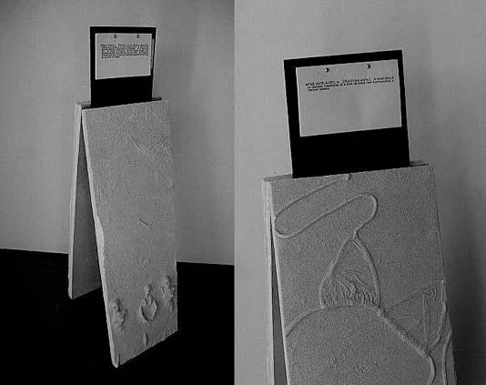
In ā page you transform language into a time-based environment. What interested you in turning something as fixed as a dictionary into a physical experience?
I am profoundly dyslexic and can barely read (depending on the time of day), so books have always been precious to me as untapped resources. The dictionary especially has had a big influence on me, as I wasn’t diagnosed as dyslexic until I was 35 years old. Most of my life, reading my misspellings, people would say, ‘What’s wrong with you? Just get a dictionary’, which would only add to my despair. Ironically, dictionaries also have beautiful line-drawing illustrations that I find fascinating: the ability to distil something down to a drawing form to convey a complete explanation of the word.
I often opened dictionaries for that purpose. Reading anything requires a high degree of my concentration, so I was leafing through a dictionary, in particular a specific ‘a’ page, and took the time and energy to read all the bolded entries and their definitions on that one page. I was struck by how these words seemed to tell a story, describing pressing contemporary issues involving the atom bomb and related subjects. I felt this narrative needed to be illustrated, and I created an interactive environment that evoked my discovery of that page. I created bas-relief plaster castings of each word and amplified each one by printing its definition, which I placed as a visual headpiece on each casting.
The plaster castings were enhanced by an artificial effect of shadow and the illusion of time passing, as the terms went in and out of relevance, depending on time and culture. The soundtrack for the work was constructed to a deliberate beat to also enhance the passing of time like an internal metronome of the heart.
In installations such as Color Complex and Las Vegas Lab Lights, viewers move through environments shaped by light, systems, and interaction. How do you approach creating these kinds of spaces?
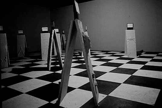
The spaces for my installations are derived from the concept’s root. In the case of Colour Complex, the piece was constructed to illustrate the relativity of colour, reminding viewers that white light contains all colours and that our perceptions are relative. The five-room setting was designed to be somewhat familiar to the viewer (like entering someone’s residence or playroom) and to remind them that their presence influenced the environment, sometimes deliberately, sometimes accidentally.
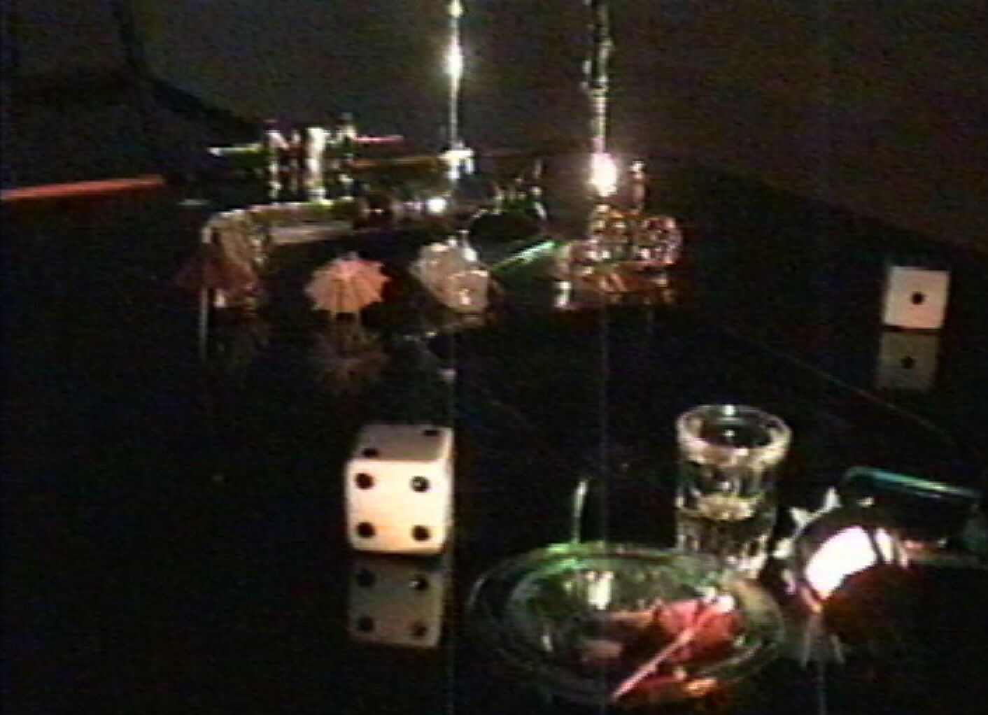
In the installation Las Vegas Lab Lights, the context of the installation was to remind the population of the issues of water in the desert environment, so I used the elements of the light and sounds of Las Vegas (through video and film) to engage the viewer in reflecting on the fragility of water in such an environment, calling into play archival footage of casino swimming pools, a sink, and a fishtank tableau—all illustrating both the finite volumes of water and the search for false treasures.
Dirty Red and Harry focuses on lived experience and social realities in Los Angeles. How did your relationship with the people involved come through in the work?
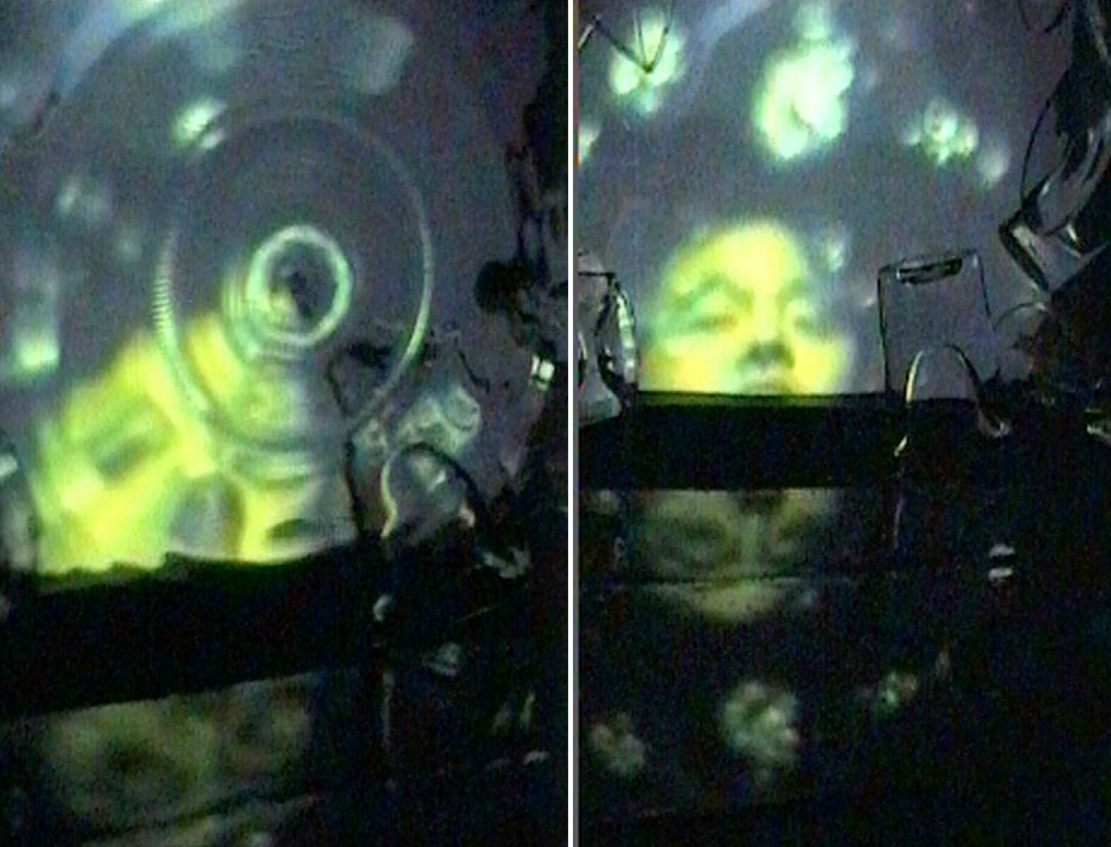
Dirty Red and Harry was constructed as the result of deliberate interaction and interviews with a homeless couple, named ‘Harry’ and ‘Dirty Red’, who seemed to hover around a sidewalk at a construction site covered with Dolly Parton posters. After several months, I gained the two gentlemen’s confidence enough to talk to them about their existence. I was acutely aware of their disposition and curious about how they arrived at that state of being unhoused. I had had the experience of being unhoused for mere months but was identifying with their isolation.
To illustrate their position in society, I used the installation format with sound and light. The sound came from my interviews with them, after coaxing them to sit and have a drink at a local bar. The projected light elements were colour separations, designed to illustrate how they interacted with people. Dirty Red was an ex-boxer who apparently fought ‘dirty’, and Harry was a husband and father who could not cope with his circumstances. I used specialised lighting projections so that when a viewer was viewing Dirty Red, he was seen in colour if no one was standing in front of him.
But if a viewer were blocking one projection, Dirty Red would become black-and-white, and in front of another projector, he would become red. Harry was completely on-and-off, like a stoplight. He was either ‘race forward’ or ‘come to a complete stop,’ so I used two projectors (one of red, one of green) to create a full colour image of him, but if you stood in front of him or one of the projectors, he would become one of the colours or the other. These men had developed a self-mythology in which the population appreciated them as pigeons, so I interwove a film loop of pigeons scurrying at their feet during the interview, as they talked about being perceived as pigeons.
The LAX Gateway Pylon Project is experienced by vast numbers of people daily and is perhaps your largest public artwork to date. Yet, many might be unaware of the artist behind it. How do you think about artistic ownership when a work becomes such an embedded part of a public space’s visual identity?
Working in public art, I have found that artistic ownership is not always connected to the work. It’s been my experience that the ‘who did it’ part is not a primary motivation, since public art is inherently collaborative rather than an artist’s sole responsibility. Alternatively, in a fine art practice, knowing the artist and their history adds greater value.
In the public art setting, it wasn’t so off-putting that it was little-known who executed the kinetic light installation. The true downside of this aspect of the work was that the piece’s purpose and conceptual structure were often overlooked because the connection to the artist was less present. The installation addresses the diversity of Los Angeles and the planet’s ecosystem, which is so dependent on diversity. These are the conceptual structures of the piece: the colours are derived from the textiles and flags of each nationality that collectively make Los Angeles the place it is.
The second half of the installation featured the essential blues and greens of our air, the water and fauna that sustain everything. So the coloured lights are stand-ins for identifying with these colours, both as individuals and as collectives from all parts of the world. The piece works to ebb and flow through colour changes, further illustrating the potential for peace and harmony. Things that offended me were the misinformation and misconceptions about the work that inevitably arose.
I was both pleased and flattered that the kinetic light installation became an icon for Los Angeles, despite a lack of attribution and people knowing its reason for being. That’s not to say that, over the years, it didn’t bother me that not only did people not understand the purpose of the public art installation, but they also did not know who created the light display. As I work on the new iteration of the Los Angeles International Airport Gateway, I anticipate a more robust campaign to share the piece’s qualities and nature with the City.
How does Los Angeles influence your work? Has it changed over time?
Los Angeles has changed my work through my association with other fine artists and artists in the creative industries (actors, musicians, filmmakers, etc.), and through the city’s population diversity. My interest in interacting with these entities has enriched my work, but my approach to incorporating their qualities remains the same.
What’s your chief enemy of creativity?
Money.
You couldn’t live without…
Family.